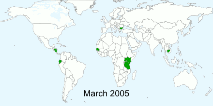
 This animated GIF shows how Kiva has grown over time. I got this idea from animated GIFs on Wikipedia showing the rise and fall of empires. I like the idea of Kiva conquering the world.
The images were generated using Google Charts API, saved as individual files, and then animated using Inkscape and GIMP. Querying the data wasn't very difficult, but creating the animation was a lot harder than I had anticipated. I'd like to build more animated and interactive visualizations, but my skills in this area are weak. If there are any Kiva geeks out there with web or flash skills and an idea for some shiny new widget, I'd be happy to provide you with some data.
Hi!
ReplyDeleteI just discovered Kiva.org and I think it's great that you are visualising a lot of this data. Really fun and interesting to see!
Keep up the good work!